
Whether you are a budding typography nerd, a subway art fanatic or just a regular ol’ crafter it is likely that you have been introduced to the wonderful world of fonts. In my ‘real world’ job I work with a lot of fonts, I’m a design assistant in an art studio. My favorite part of the job is getting a few general guidelines and being able to ‘do my thing’ and create. Fonts are more than just the words typed in them. I’ve never taken a single design class but I’ve learned a lot over the last few years and I’m going to share some tips with you:
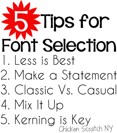
1. Less is Best
I love a good decorative fancy font. BUT they have their place. The more text you have, the simpler it should be. There is a reason most documents are set in Arial, Helvetica or Times New Roman. Those fonts are simple and easy to read. Don’t feel limited to those three basics though! Just stick with something basic. The basic font pages at Dafont are a good place to start. Here are a few to try out:

Caviar Dreams, Chanticleer Roman, Linux Biolinum
2. Make a Statement
This is basically the opposite of tip 1. Monograms, titles and headings are the best times to pull out your crazy, ornate and fancy fonts. Single letters in a ‘wow’ font can make an awesome impact. PLEASE make sure your titles are readable. Fancy can quickly turn to illegible. You’d never want to read a paragraph in one of these fonts but used correctly they really make a statement:

Backspacer Tribute To Pearl Jam, Constanze Initials, Goudy Initialen
3. Classic vs Casual
There is a time and a place for everything, except Comic Sans. Just kidding, kind of. Comic Sans, Jokerman and Curlz are three fonts that should never leave a kids birthday card. Thin lines or a mix of thin and thick have a naturally casual feeling while bold-lined serif fonts lend a more serious mood to a document. Likewise, elegant scripts are more at home on a formal invitation than a handwritten style. There are no hard and fast rules about what makes one font more serious than another; but it’s something to consider when selecting a font for your next project.

Classic: Gabrielle, Oxygen, Vollkorn

Casual: KG Behind These Hazel Eyes, KG Seven Sixteen, KG Somebody That I Used to Know Kimberly Geswein has hundreds of fun, casual fonts
4. Mix It Up
If you’re using more than one font for a project mix up the styles. I like to pair one script with one serif or sans serif. Using one thick, blocky font and one thin and fluid font together creates texture in your piece. Don’t go overboard though. In my opinion it’s better to err on the side of caution and keep it to 3 or fewer fonts.

Ecuyer, Allura, KG Behind These Hazel Eyes, KG Seven Sixteen
5. Kerning is Key
Kern is the fancy term for spacing between letters. Well crafted fronts shouldn’t be a problem but occasionally you’ll have fonts with awkward spacing. You can adjust spacing in some programs like Photoshop and Silhouette Studio but most cheap or free programs won’t allow you to move letters. Cursive-style fonts where one letter touches the next should appear to be one line. It’s the difference between the top line and the bottom one:

Allura
Extra Tip: Check ALL your letters
One thing I do a lot of is setting up names for embroidery. Sometimes seemingly normal fonts have random odd ball letters. If you’re setting up a bunch of names or words in a new font I recommend checking out the whole alphabet before you start printing or cutting. This goes double for scripty, calligraphy-styles letters. It sucks to get to the end of a list of names and figure out the capital F looks more like a T